trade secrets for a stylish & savvy kitchen
It’s been a whirlwind of activity over here at EGD these past few months with a bunch of home renovations and new builds; and in the mix are lots of new kitchen designs. With 15 kitchens now underway, we thought we would share some of our go-to tips for those of you who might be considering a new kitchen in your future.
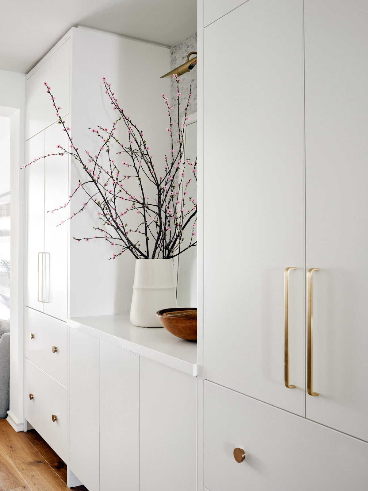
MAXIMISE EVERY INCH OF VERTICAL SPACE
You don’t need to live in a Victorian with 10-foot high ceilings to maximise your vertical space. The reality is that many of us store things in our kitchens that we use infrequently - flower vases, our large Thanksgiving turkey platter, or that fondue pot we pull out once a year for Valentine's Day. These are the types of things we don’t need to have in easy-to-reach cupboards. ‘Think Tall’ when planning out your kitchen – you'll never regret the extra space. Never!
Design: Stephanie Houghton, Photo: Patrick Biller
THINK OUTSIDE THE BOX (OR SHOULD WE SAY CABINET?)
We all grew up in kitchens with upper cabinets filled with glassware and plates - a sea of cabinets that screamed “I am a kitchen, hear me roar!” But many of us are now living more casually in open concept spaces and want to integrate our kitchens into the overall look and feel of our homes. So maybe we don’t need (or want) them to feel quite so kitcheny…maybe instead of a roar, we want a more stylish “meow”.
Designer: Emily Griffin, Photo: Virginia Macdonald
We still need to store our stuff – it's a kitchen after all, so it should be practical and not just pretty. But instead of a long row of upper cabinets that stretches across the wall, what about floor-to-ceiling cabinets that give you lots of storage for your glasses and dishes? Or what about using below-the-counter drawers instead?
let it breathe
Plan for some open space in your kitchen design (especially above countertop height) – it helps a kitchen feel airier and more spacious, and can give you great decorating opportunities too. Whether it’s art, a wall of gorgeous tile or even wallpaper; your kitchen will automatically feel less like a ‘kitchen’ and more like a stylish room in your home.
(L) Design: Stephanie Houghton, Photo: Patrick Biller (R) Design: Emily Griffin, Photo: Sian Richards
DOUBLE DOWN WITH 2-IN-1S
Probably one of our favourite tricks is the 2-in-1 drawer. We love them because they create two layers of storage within one drawer. Why is this smart? Imagine standing at your stove wanting everything within arm’s reach (because you’re cooking after all, and you deserve that kind of easy storage life). With 2-in-1 drawers flanking either side of your stove, you can reach your cooking spices and utensils in one drawer and your food wraps, and knives in the other drawer without even breaking a sweat.
Design: Stephanie Houghton, Photo: Patrick Biller
MAKE IT CURRENT AND TIMELESS
Yes! It’s possible to be current AND timeless. Kitchens are not cheap, and with the ever-increasing price of things, you don’t want to wish you had stuck to the classics in 2 years’ time. Make sure you pick timeless elements for the expensive things like the cabinetry. It’s okay to be influenced by trends, but always mix in the enduring classics.
For example, you can take a shaker profile and modernize it by thinning it out. Same goes for the backsplash tile - you don’t want to be chipping that puppy out down the road. Hardware is a different story because pulls and knobs can be changed easily. So, pick what you like for hardware, and don’t be afraid to mix metals to make it more interesting.
Design: Emily Griffin, Photo: Sian Richards
RE-THINK THE ISLAND
Not every kitchen needs an island, and some are better off without one. Take my own kitchen for example - I designed it without an island to make room for a leggy, butternut wood table - a solid kitchen island in the middle of the room would have blocked the view into my sunroom and this gives me the perfect perch for a glass of wine with friends.
In our colourful Riverdale kitchen, we created a useful kitchen prep and storage table that also allows for more views into the family room and the beautiful garden beyond.
(L) Design: Stephanie Houghton, Photo: Patrick Biller (R) Design: Emily Griffin, Photo: Sian Richards
We love designing kitchens with a large table in the centre too (versus an island). It’s a great place to prep food and an even better gathering spot for casual meals and friends to hang out while you’re cooking
Design: Emily Griffin, Photo: Sian Richards
For more show and tell, follow along on Instagram to see how some of our kitchens are progressing! And if you want help with yours, please contact us at studio@egdesign.ca


